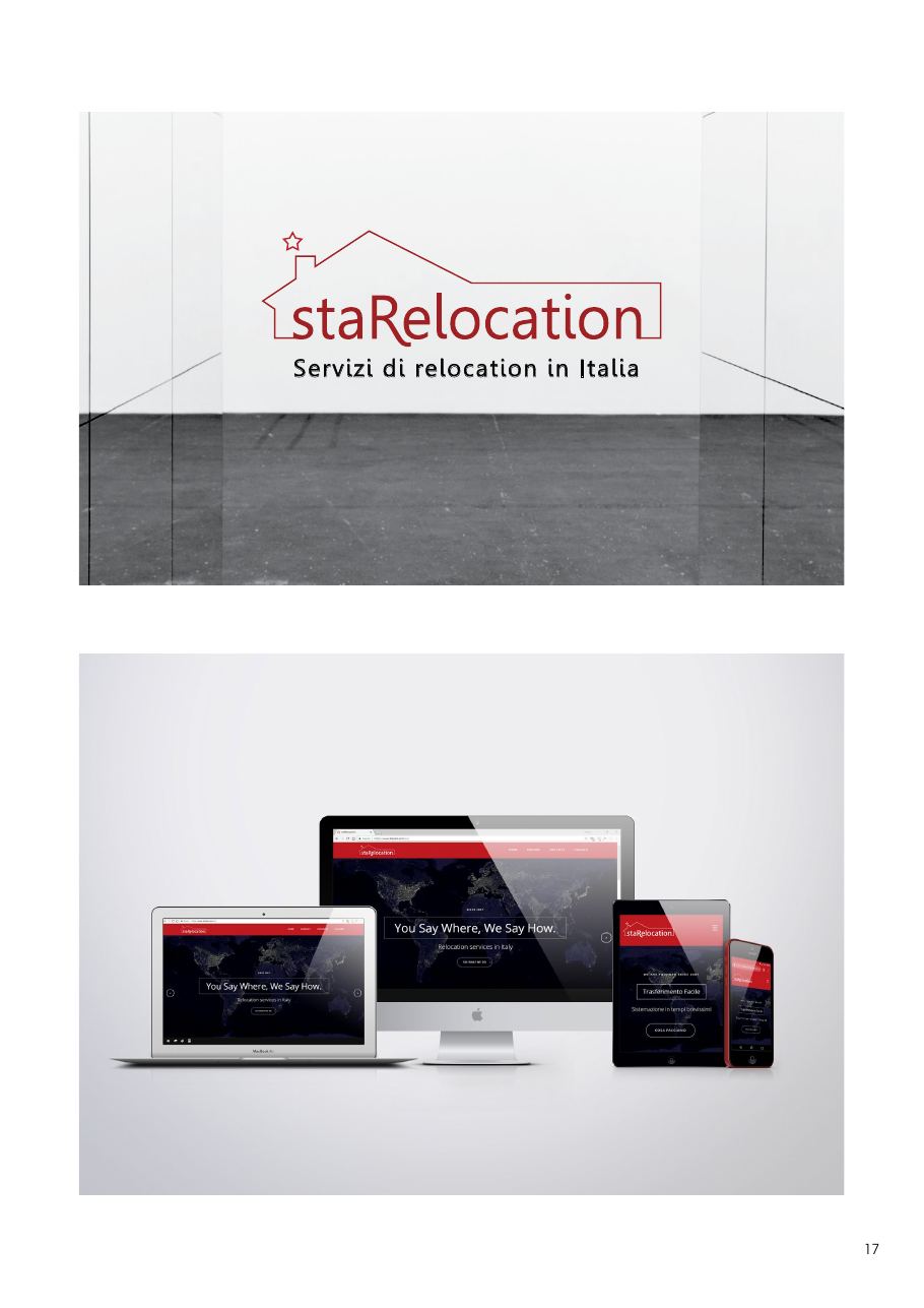
staRelocation
A warm, reassuring rebrand for an agency that has been helping expats feel “at home” in Italy since 2007.
- Client
- staRelocation — Relocation services in Italy
- Services
- Rebranding, Logo Design, Visual Identity, Event Material, Web Design (UI/UX)
- Role
- Graphic Designer
The project
Active since 2007, staRelocation supports expatriated professionals and international companies with 360° relocation services. The mission is clear: make the transition simple and make the client feel — literally — at home.
The wordmark is embraced by the stylised silhouette of a house, with a star (a direct nod to the “star” prefix) rising from the chimney to symbolise guidance and excellence of service.
A vibrant institutional red carries energy, dedication and passion, while ample white space and delicate grey‑blues keep the system elegant and corporate.
The fully responsive website pairs a dark, illuminated world map with the claim “You Say Where, We Say How.” and clear CTAs — designed to reassure international users from the very first scroll.